
The posters are all abstract/ modern in design and there is a notable absence of realism within the pieces. The 12 Artists include Fiona Banner, Michael Craig-Martin, Tracey Emin, Gary Hume, Sarah Morris, Bob and Roberta Smith, Martin Creed, Anthea Hamilton, Howard Hodgkin, Chris Ofili, Bridget Riley and Rachel Whiteread; all of whom were shortlisted to create the posters from a list of around 100 artists.

We must take a closer look at some of the posters and there artists. Firstly Howard Hodgkin's Swimming. A simple piece using the material of paint to mimick the fluidity of water, it will be a painting that will divide audiences and many will just see it as a squiggle of a paint brush, but personally Hodgkins has created a dramatic wave which sums up the excitement and drama of a swimming race and the artist himself describes his work as "representational pictures of emotional situations" and through simple brush strokes has capture a vivd sense of movement and fluidity, and ambiguity of the darkened space; is it a swimmer?? adds a further layer of interest to the poster.
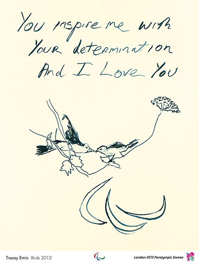
Tracey Emin is another one of the artists featured, I have never really been a fan of Emin, mainly because of the shocking nature of her work, which i find quite hard to appreciate, but her olympic poster seems a lot more simple and resigned than usual and its message adds an air of innocence to proceedings, especially with its accompanying plain white background.

One of the posters that I am not particually a fan of is Martin Creed's Work no. 1273, firstly the title, I dont understand why there is a need for an abstract title as I think it alienates the mass market many of whom already see modern art as slightly elitist. The painting depicts a podium but it has a static and basic element which makes it personally unapealling, and does not promote an air of achievement. Then there are the colours which are supposed to represent the colours of the olympic rings, but they are muted and dulled down, which once again does not really encourage achievement, making the whole thing seem dull and unassuming.

Michel Craig-Martins poster I think will be a popular design, his distinctive style is evident and it portrays a very simple and clear of the message that people will be able to understand/connect to.
Although some of the posters have considerable artistic merit. I think the paintings should not be as abstract, as although they evoke a reaction there has already been much controvery over the abstract olympic logo, so such modern posters seem quite an odd move, but they are obviously trying to make an olympics for the modern age. When you compare the posters for the 2012 olympics to the poster for the last olympics held in London in 1948 there is a stark contrast, and I think the 2012 posters make it in noone clear where the olympics are occuring as London is vibrant and cultured host city, but you could not tell thisfrom the posters.
No comments:
Post a Comment